
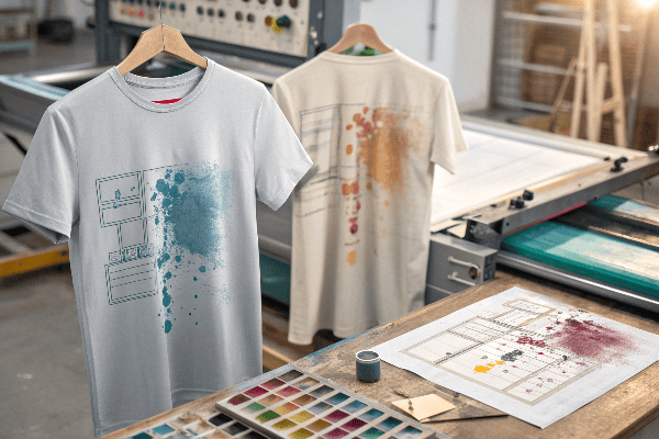
T-shirt printing seems easy—upload a design, hit print, and you're done. But in reality, even small mistakes in the design phase can lead to blurry, cracked, or off-centered prints. These flaws can ruin your product and your brand image.
Common design flaws in T-shirt printing include low-resolution images, poor color contrast, misaligned graphics, and neglecting fabric compatibility. These issues often cause print defects, fading, or poor wearability.
I’ve seen many brands make these avoidable mistakes—especially when rushing to meet deadlines or skipping test prints.
Table of Contents
- Why does image resolution matter so much?
- What happens when colors don’t contrast well?
- How does print placement go wrong?
- Why does fabric compatibility matter?
- Conclusion
Why does image resolution matter so much?
Because pixelation is hard to unsee.
Low-resolution images (under 150 DPI) will look blurry or grainy when enlarged for printing, especially on large areas like the chest or back.
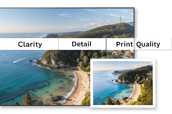
Ideal image quality for T-shirt printing
| Print Area | Minimum Resolution | Ideal File Size |
|---|---|---|
| Chest logo (4-5") | 1000 x 1000 px | 300 DPI PNG/JPG |
| Full front (10-12") | 2500 x 3500 px | 300 DPI PNG, 5MB+ |
| All-over print | 4500 x 5700 px | Vector or large raster |
When customers send screenshots or web images, we always advise replacing them with originals to avoid poor results.
For file prep help, refer to Printful's image requirements【^1】.
What happens when colors don’t contrast well?
Your design gets lost.
Low contrast between design and T-shirt color makes the image hard to see, especially under natural lighting or at a distance.
Avoiding poor contrast
- Dark images on black shirts = invisible design.
- White text on pastel shirts may lack impact.
- Use outlines or shadows to increase legibility.
We often suggest mockups on different shirt colors to show how your design will actually appear when worn.
Learn more about choosing effective colors from Designhill’s color contrast guide【^2】.
How does print placement go wrong?
Poor alignment ruins the balance.
Misplaced designs—too high, too low, or crooked—can make the shirt look cheap or uncomfortable. Proper alignment is key to professional results.
Common placement mistakes
| Design Location | Typical Issue | Fix |
|---|---|---|
| Left chest | Too close to armpit | Align 3" from collar center |
| Center front | Printed too low | Center 2" below collar |
| Sleeve prints | Not angled with arm shape | Use curved sleeve template |
We always test on real garments, not just flat mockups, to spot these problems early.
For exact print specs, check T-Shirt Help Desk’s placement guide【^3】.
Why does fabric compatibility matter?
Because not all prints work on all fabrics.
Some designs look great on cotton but fail on polyester due to dye migration or low ink absorption.
Match your method to your material
| Fabric Type | Risk When Mismatched | Best Print Method |
|---|---|---|
| 100% Cotton | Fades if ink not cured well | DTG, screen printing |
| Polyester | Dye bleeding, migration | Sublimation or plastisol |
| Stretch blends | Cracking from ink stiffness | Heat transfer vinyl, DTF |
We test every combination before bulk printing—it's the only way to be sure.
For a detailed look at fabric compatibility, read Ryonet’s fabric vs ink guide【^4】.
Conclusion
Design flaws in the T-shirt printing process can cost you time, money, and customers. By focusing on image quality, color contrast, placement, and fabric compatibility, you can avoid common errors and deliver prints that truly stand out.
[^1]: Printful – Image Requirements for Print
[^2]: Designhill – The Importance of Contrast in Graphic Design
[^3]: T-Shirt Help Desk – T-Shirt Placement Guide
[^4]: Ryonet – Understanding Fabric Compatibility with Inks