

How Does Color Matching Work in Clothing Production? Pantone, Lab Dips, and Dye Lots Explained
You choose the perfect sage green on your laptop.
The first sample arrives.
It looks:
more grey.
The drawcord is a little warmer.
The embroidery thread looks brighter.
Then, three months later, you reorder the same hoodie.
The new batch looks slightly deeper again.
Nothing seems dramatically wrong.
But everything is just different enough to make you nervous.
This is one of the most common problems in clothing development:
color is not controlled by a single code.
Color matching in clothing production means matching the actual fabric, trims, printing, and embroidery to an approved physical target within an agreed tolerance. Pantone references and digital files help communicate the target, but the final appearance is affected by fiber, fabric construction, surface finish, dye chemistry, printing method, lighting, and production batch.
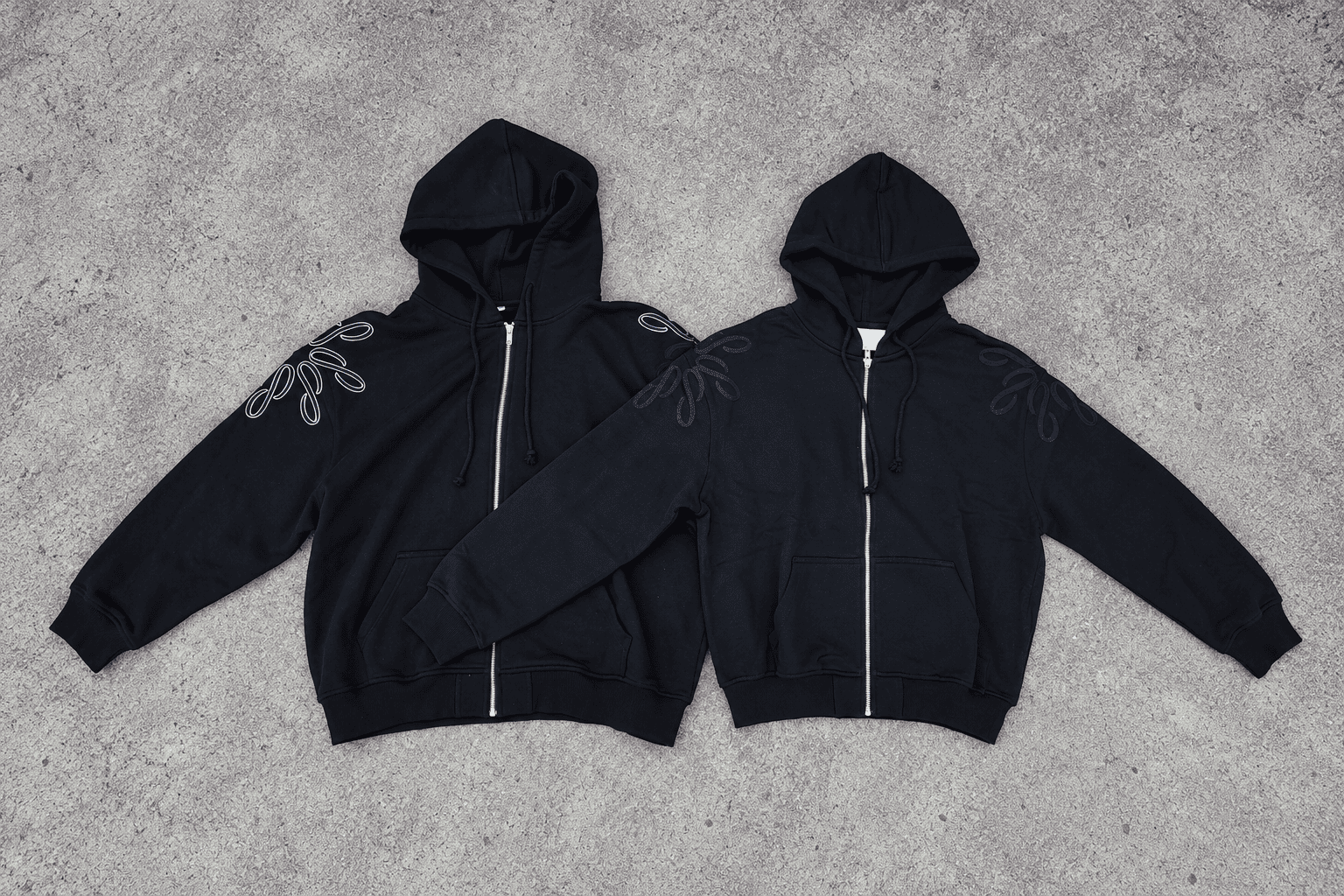
That is why:
“Pantone 17-XXXX TCX”
is a very useful starting point.
But it is not the end of the process.
The goal is not to make:
every material chemically identical.
The goal is to make the finished garment look:
controlled and intentional.
Table of Contents
- Why Is Color So Hard to Match in Clothing?
- How Should You Give a Factory Your Colors?
- What Is a Lab Dip, and When Do You Need One?
- Why Do Trims and Prints Not Always Match Exactly?
- How Do Dye Lots Affect Bulk and Reorders?
- How Do You Approve Color Without Surprises?
- Conclusion
Why Is Color So Hard to Match in Clothing?
A color code feels precise.
Textiles are more complicated.
The same target color can look different on cotton, polyester, nylon, rib, fleece, brushed fabric, printed ink, embroidery thread, plastic, and metal because each material absorbs, reflects, or transmits light differently.
Screens Are Not Fabric
A monitor creates color using:
- Red
- Green
- Blue light
Fabric shows color by:
- Reflecting light from its surface
Those are fundamentally different systems.
This is why:
HEX
RGB
screen screenshots
should not be your final approval standard for dyed fabric.
The color may also look different on:
- Your laptop
- Your phone
- Your customer's monitor
because each display is calibrated differently.
Fiber Changes the Result
Cotton, polyester, and nylon do not use exactly the same:
- Dye classes
- Dyeing conditions
- Finishing systems
So even if the target is identical, the final visual result can differ.
Fabric Construction Changes Appearance
Compare the same color direction on:
- Smooth jersey
- Heavy French terry
- Rib
- Waffle
- Brushed fleece
The surface texture changes how light interacts with the material.
A brushed fabric may look:
- Softer
- More matte
- Less visually sharp
than a smooth surface.
But do not use a universal rule such as:
“brushed fabric always looks lighter.”
The result depends on the actual:
- Color
- Fiber
- Finish
- Lighting
GSM Can Affect Perception
Fabric weight can influence:
- Density
- Opacity
- Surface depth
but GSM alone does not determine color.
Two 400 GSM fabrics can still look different because their:
- Yarn
- Knit structure
- Finish
are different.
Lighting Changes What You See
This is one of the biggest causes of color disputes.
A fabric can look acceptable in:
daylight
and different under:
- Warm store light
- Fluorescent light
- LED light
This phenomenon is one reason textile color evaluation is normally done under agreed viewing conditions.
Metamerism
Two materials may appear close under one light source but different under another.
This is called:
metamerism.
It becomes especially relevant when matching:
- Body fabric
- Rib
- Thread
- Drawcord
- Plastic trim
made from different materials.
Dye Lot Also Matters
Bulk fabric is produced in batches.
Each batch can show:
small shade variation
due to production factors.
This is why color control does not stop after the first approval.
How Should You Give a Factory Your Colors?
The better your color reference, the easier it is for the factory and mill to understand what you want.
For apparel, a physical textile color standard or physical fabric swatch is more reliable than a screen value. Pantone Fashion, Home + Interiors references are widely used for textile communication, but the target still needs to be evaluated on the actual fabric substrate.
Pantone FHI for Apparel
Pantone Fashion, Home + Interiors[^1] is Pantone's color system developed for products including:
- Textiles
- Apparel
- Soft goods
Within the FHI system, TCX identifies textile cotton standards.
That makes TCX especially useful for communicating apparel color targets.
But it is important to understand what that means.
It does not mean:
“TCX on cotton guarantees every finished garment will look identical.”
The fabric still differs in:
- Fiber
- Surface
- Finish
- Dyeing method
Why Use Physical Standards?
Pantone itself notes that digital simulations are not a substitute for physical Pantone standards.[^1]
So if the color is commercially important, approve it using:
- Physical Pantone reference
- Physical fabric swatch
- Approved lab dip
rather than only:
- Screenshot
- Website image
- RGB code
Physical Fabric Swatch
A fabric swatch can be even more useful than Pantone if it represents the exact result you want.
For example:
“Match this hoodie body color.”
That lets the mill compare:
textile to textile.
But the factory should still note:
- Fiber type
- Surface
- Finish
because a polyester swatch may not reproduce identically on cotton.
Reference Garment
An existing garment is useful when you like:
- Color
- Hand
- Finish
But garments can already have:
- Wash effects
- Fading
- Aging
So the supplier should understand whether you want:
the original dye shade
or:
the garment's current appearance.
Stock Fabric Color Card
For smaller orders, choosing from existing fabric is often the most practical route.
Ask for a physical:
fabric color card
or swatches where possible.
A photo of the card is useful for narrowing choices.
It should not be treated as final color approval.
Color Communication Methods
| Method | Best use | Main limitation |
|---|---|---|
| Physical fabric swatch | Exact visual target | Different substrate may still vary |
| Pantone FHI TCX | Apparel color communication | Target still needs fabric approval |
| Factory fabric card | Stock fabric selection | Limited to existing colors |
| Reference garment | Visual direction | May include wash / aging |
| Print Pantone reference | Print artwork | Not the same as fabric dye |
| HEX / RGB | Digital communication | Not a textile approval standard |
What Is a Lab Dip, and When Do You Need One?
A lab dip is one of the main tools used before custom fabric dyeing.
A lab dip is a small dyed fabric sample prepared by the mill to show how the target color looks on the actual or representative textile before the full bulk dye lot is produced.
When Do You Need a Lab Dip?
Usually when you are:
- Custom dyeing fabric
- Developing a brand-specific color
- Producing a larger order
If you are simply buying:
stock black
from existing inventory, a new lab dip may not be necessary.
Why Use the Actual Fabric?
Color should ideally be evaluated on:
the same or representative substrate
because:
- Cotton
- Polyester
- Rib
- Fleece
may produce different visual results.
Do Lab Dips Always Come as A, B, and C?
No.
Many mills may submit several options such as:
A
B
C
to show slightly different directions.
But this is a commercial practice, not a universal technical rule.
A mill may submit:
- One option
- Two options
- Three or more options
depending on:
- Customer
- Color difficulty
- Mill procedure
How Should You Comment on a Lab Dip?
Avoid feedback such as:
“Not right.”
Give directional comments.
For example:
- Slightly greener
- Less yellow
- More blue
- Slightly darker
- Reduce saturation
This helps the dye technician understand what to change.
Approval Should Be Recorded
Do not approve:
“the middle one.”
Record something like:
Lab Dip B — Approved — 18 Oct 2026
and keep:
- Physical swatch
- Photo
- Internal reference
where possible.
Stock Color vs Custom Dye
| Stock color | Custom dye | |
|---|---|---|
| Color choice | Existing range | Developed to target |
| Lab dip | Usually unnecessary | Commonly required |
| MOQ | Often easier for small runs | Mill MOQ may apply |
| Timing | Faster | Adds development time |
| Color control | Choose closest stock | Approve specific target |
| Best for | Small runs | Larger / brand-color programs |
Fabric MOQ
Custom dyeing usually creates a textile-mill MOQ.
That MOQ may be quoted in:
- Kilograms
- Rolls
- Meters
There is no single universal number.
Ask the actual mill.
Small Brand Strategy
For a first drop, it may make more sense to choose:
the closest stock sage green
instead of creating a fully custom dye.
Once volume grows, move to:
custom lab-dip approval.
That is often more efficient.
Why Do Trims and Prints Not Always Match Exactly?
This is where brands sometimes expect something physically unrealistic.
A hoodie may contain:
- Cotton French terry
- Cotton/elastane rib
- Polyester sewing thread
- Polyester drawcord
- Metal zipper
- Embroidery thread
- Screen-print ink
These are different materials.
Color matching across different substrates means creating the closest controlled visual relationship between components, not assuming every material can reproduce exactly the same color response.
Rib
Body fabric and rib may have:
- Different knit structures
- Different elastane content
- Different surface texture
So even when both are dyed toward the same target, they can appear slightly different.
Check them:
together.
Not separately.
Sewing Thread
Thread suppliers normally provide:
color cards.
The factory chooses the closest appropriate thread.
For many garments, the visual match can be very close.
But exact behavior depends on the:
- Thread fiber
- Finish
- Lighting
Drawcord
Drawcord suppliers also work from their own:
- Material
- Color range
- Production MOQ
Small orders often use:
- Closest stock cord
- Supplier-available colors
A custom color may require a separate MOQ.
Do not publish:
“custom drawcord always needs 1,000 meters.”
That number depends on the supplier and product.
Zippers
Zipper tape and hardware may each have their own color systems.
For example:
- Tape color
- Teeth
- Slider
- Puller
may need separate decisions.
Embroidery
Embroidery thread is selected from:
physical thread cards.
That means your Pantone reference is usually translated into:
the closest available embroidery-thread shade.
Custom-dyed embroidery thread may be possible for larger programs, but supplier minimums apply.
Screen Printing
Ink can be mixed toward a target color.
But the final print can still change based on:
- Fabric color
- Ink opacity
- Underbase
- Print method
- Curing
- Surface texture
So approve the print on:
the actual or representative garment fabric.
Brushed Fabric
On brushed surfaces, artwork can visually appear:
- Softer
- Less crisp
depending on the print system.
Do not automatically say:
“the print becomes lighter.”
Test the real material.
Decide Which Colors Need the Tightest Match
Not every component requires the same tolerance.
For example:
A tonal inside drawcord may tolerate a slightly wider visual difference.
Your main brand logo may need much tighter control.
Prioritize accordingly.
How Do Dye Lots Affect Bulk and Reorders?
A dye lot is a production batch of dyed textile.
This is where repeat orders become more challenging.
Different dye lots can show shade variation even when they are produced toward the same target. Good control means keeping an approved standard, identifying lots, evaluating bulk against that standard, and defining an acceptable color tolerance rather than promising that future batches will be visually identical under every condition.
Do Different Dye Lots Always Look Different?
Not necessarily in a way the customer can see.
A good mill may produce:
very close repeat shades.
But some variation risk remains.
That is why the professional goal is:
controlled repeatability
not:
absolute identicality forever.
Keep a Reference
Useful standards include:
- Approved lab dip
- Bulk fabric approval
- Previous dye-lot swatch
- Pantone reference
For repeat orders, the new dye lot should be checked against the agreed standard.
Keep Dye Lots Identified
Rolls should be identifiable by:
- Dye lot
- Roll number
where applicable.
This helps avoid mixing material carelessly.
One Garment Should Avoid Obvious Shade Mixing
A particularly visible problem occurs when:
front panel
and:
back panel
show different shades.
Where practicable, panels used within one garment should come from compatible shade groups.
Matching Sets
For:
hoodie + sweatpant
or:
top + leggings
the pieces should also be reviewed together.
They do not necessarily have to be cut from the exact same physical roll.
What matters is:
- Same approved specification
- Controlled shade relationship
Reorders
Suppose you produce:
Black Hoodie — January
then reorder:
Black Hoodie — September.
The factory should compare the new material with:
the approved previous standard.
But the correct promise is:
matched within agreed tolerance
not:
100% identical dye lot.
How Do You Define Color Tolerance?
This is an important step for larger programs.
Words such as:
“close enough”
are subjective.
For more controlled production, brands and suppliers can agree on:
- Visual standard
- Lighting condition
- Instrumental tolerance where required
CIELAB
Instrumental textile color evaluation commonly uses color-space values such as:
CIELAB / L*a*b*
to describe differences in:
- Lightness
- Red–green direction
- Yellow–blue direction
The International Commission on Illumination (CIE)[^2] provides the internationally recognized framework for colorimetry, including CIELAB color-space concepts.
Delta E
Color difference may be expressed using:
ΔE
values.
But do not publish one universal:
“ΔE below X is always acceptable.”
The correct tolerance depends on:
- Product
- Brand standard
- Substrate
- Customer expectation
- Measurement method
Agree the limit before production if instrumental measurement is important.
Visual Approval Still Matters
Even when instrumental readings are used, apparel brands often still review the actual materials visually.
This is especially important when comparing:
different substrates.
Two materials can have acceptable numbers and still appear different because of:
- Gloss
- Texture
- Surface structure
How Do You Approve Color Without Surprises?
A good color approval process is simple:
define the reference, approve physical material, use agreed lighting, document the approval, and keep the standard for bulk and reorders.

Step 1: Define the Target
Use:
- Pantone FHI textile standard
- Physical swatch
- Approved garment
and record exactly which one controls the color.
Step 2: Confirm the Substrate
For example:
400 GSM 100% cotton French terry
not simply:
green fabric.
Step 3: Approve the Lab Dip
For custom dyeing:
approve the physical lab dip.
Keep the approved reference.
Step 4: Use Controlled Lighting
For professional color evaluation, controlled illumination is much better than:
warm office lighting.
ISO 3668:2017[^3] describes visual comparison of the color of paints under standardized lighting conditions; in textile practice, the same underlying principle matters: the viewing conditions need to be controlled and agreed.
For textile programs, companies commonly use standardized light sources in a light box for visual comparison.
The important point is consistency.
Step 5: Review the Complete Garment
Do not approve:
body fabric only.
Put together:
- Body
- Rib
- Drawcord
- Zipper
- Thread
- Embroidery
and look at the full color relationship.
Step 6: Approve Bulk Material
Before large-scale cutting, compare bulk material with:
the approved standard.
Step 7: Keep the Standard
Save:
- Lab dip
- Bulk reference swatch
- Dye-lot information
for future reorders.
Color Approval Checklist
| Check | What to confirm |
|---|---|
| Target | Pantone / swatch clearly identified |
| Fabric | Correct fiber, GSM, finish |
| Lab dip | Approved reference recorded |
| Light | Agreed viewing condition |
| Rib | Checked next to body |
| Trims | Evaluated with garment |
| Approved on actual substrate | |
| Embroidery | Thread card / sample approved |
| Bulk | Checked before cutting |
| Dye lot | Identified and controlled |
| Reorder | Matched against saved standard |
| Tolerance | Written and understood |
What About Pantone Color of the Year?
It can be useful for:
- Trend content
- Collection inspiration
but it does not change the technical color-matching process.
Pantone announced PANTONE 11-4201 Cloud Dancer as its Color of the Year for 2026.[^4]
If your brand chooses that color, you still need to decide:
- Which fabric
- Which finish
- Which physical standard
- Which tolerance
because:
a Pantone name does not dye the garment for you.
Green Flags and Red Flags
| Green flag | Red flag |
|---|---|
| Requests physical textile references | Works only from screenshots |
| Uses Pantone FHI appropriately | Treats HEX as textile approval |
| Explains substrate differences | Guarantees every material will match exactly |
| Uses lab dips for custom dyeing | Skips color development on custom colors |
| Keeps approved standards | Relies on memory |
| Identifies dye lots | Mixes rolls without control |
| Checks rib beside body fabric | Approves every component separately |
| Confirms trim supplier limitations | Promises any trim color at tiny MOQ |
| Approves prints on actual fabric | Approves only digital artwork |
| Uses agreed viewing conditions | Approves under random warm lighting |
| Defines tolerance | Says only “close enough” |
| Controls reorder shade | Guarantees identical dye lots forever |
Conclusion
Color matching in clothing production is not:
type a Pantone code → receive perfect color.
Pantone is the beginning of communication.
Then you need:
- The right substrate
- The right dyeing process
- A physical approval
- Controlled evaluation
- Bulk shade control
For stock fabrics:
choose from physical swatches whenever possible.
For custom dyeing:
use a lab dip.
For trims:
understand that:
- Thread
- Drawcord
- Zipper
- Rib
may come from different suppliers and materials.
They need to be visually coordinated.
They are not always capable of reproducing the same target in exactly the same way.
For print and embroidery:
approve:
- Ink
- Thread
- Placement
on the actual garment or representative substrate.
Then manage dye lots.
Keep:
- Approved reference
- Bulk swatch
- Lot information
and use them for reorders.
Do not promise:
“the next batch will be identical.”
Promise something more professional:
“The new batch will be matched against the approved standard and controlled within the agreed tolerance.”
That is how color becomes a production standard instead of an argument.
Because in clothing manufacturing, color matching is not about finding one perfect code.
It is about creating a repeatable:
reference → approval → production → inspection
process.
Footnotes & References
[^1]: Pantone — Fashion, Home + Interiors. Pantone's FHI system is developed for industries including fashion and textiles. TCX standards are textile cotton references intended for physical color communication, while Pantone advises that digital representations should not replace physical standards for final color evaluation.
https://www.pantone.com/na/en-us/fashion-home-interiors
[^2]: International Commission on Illumination — Colorimetry, 4th Edition (CIE 015:2018). Provides internationally recognized colorimetric principles and color-space frameworks, including CIELAB, used for communicating and evaluating measured color differences.
https://cie.co.at/publications/colorimetry-4th-edition
[^3]: International Organization for Standardization — ISO 3668:2017, Paints and Varnishes — Visual Comparison of Colour. Provides standardized principles for visual color comparison under controlled illumination. Although written for paints and varnishes, it illustrates the importance of defined viewing conditions when making visual color judgments; apparel programs should use textile-appropriate agreed light sources and internal/customer standards.
https://www.iso.org/standard/59341.html
[^4]: Pantone — Pantone Color of the Year 2026: PANTONE 11-4201 Cloud Dancer. Pantone announced PANTONE 11-4201 Cloud Dancer as its Color of the Year for 2026. Trend selection does not replace physical textile color approval for production.
https://www.pantone.com/color-of-the-year/2026